#6–Ease in & Ease out
Motion curves are used in animation to describe how an object moves. Check out this website to see some examples of the curve and corresponding motion. An easing curve is a type of motion curve that describes the most common type of motion: an object going from rest to motion, or vice versa. Think of a plane starting its takeoff, it’s slow at first and speeds up with time – that’s an easing curve.
Whether slow like a plane or fast like a hummingbird, everything in the real world moves with an easing curve. Only in the computer realm (or maybe UFOs) can something instantly appear, disappear, or change direction.
In product design, easing animations are extremely important because things that move more naturally feel more familiar and predictable to people – both feelings you want people to have about your product. A Product Manager who can leverage motion effectively can make their products both more usable and enjoyable.
Animation is particularly critical in mobile apps where people physically touch the software. I challenge you to find a single action on your iPhone that isn’t animated – if you do, let Apple know because it’s probably a bug. This focus on animation is what made iPhones so approachable and gave Apple a huge advantage over Google at the dawn of the smartphone era. Even 5 years after the iPhone launched, Google was still trying to catch-up with initiatives like Project Butter to improve the laggy, janky feeling people found off-putting.
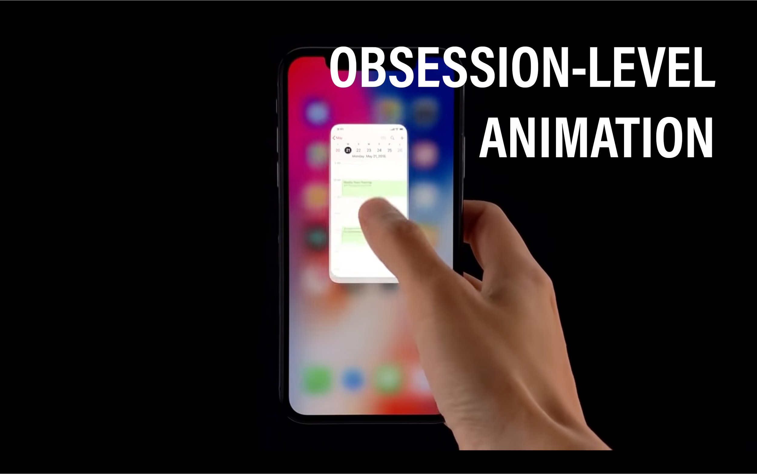
🍓🍓 Watch the first 30sec of this video to see obsession-level animation design in software.
These beautiful and subtle animations are what make an iPhone touch interface feel so good.
This level of animation obsession wasn’t Jony Ive running amuck, it’s an acknowledgement of the importance of how something feels. Yet, despite the importance, it’s often deprioritized in companies. Why?
Simply put, the benefit is hard to quantify and the cost is high, and most businesses allocate resources based on the ROI (return on investment). How much will nice animations improve conversion? 🤷♂️ There’s no way to know, and if it can’t be proven, people must believe. Only in companies where the culture (aka. religion) believes, will energy be invested. Or, until the evidence becomes so glaring that you can’t ignored it (as was the case with Google).
Note though, animations shouldn’t always be highly prioritized. At startups, for example, building the right features for product-market fit could be more important. A beautifully animated app that doesn’t solve a problem will fail. In the case of the iPhone, Apple understood that a touch UI with any perceptible lag would feel awkward, unpredictable, and therefore be a dealbreaker for customers who already had a “good enough” phone, so they prioritized it from the start. This won’t always be true so it’s important to think critically and not be an animation zealot.
What’s nice today is that almost every web and mobile UI framework has built-in animations, making adding them easy. All you need to know is how much animation is enough animation, which but that’s a whole other skill.

